Jameson Embraces Roots with Whiskey Bottle Redesign

Jameson is among the many alcoholic beverage brands to undergo recent packaging redesigns.
Courtesy of Jameson
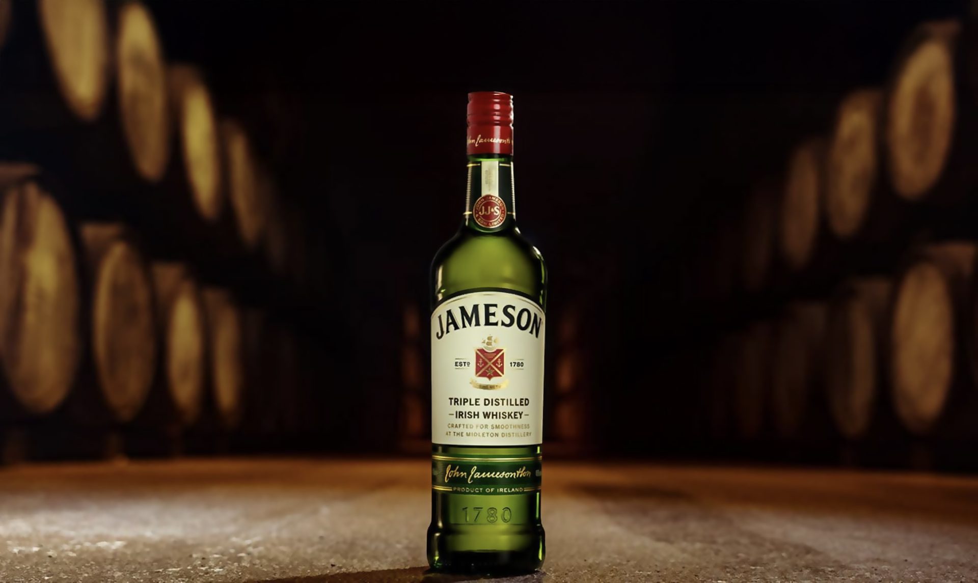
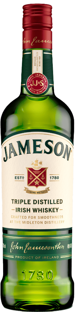
Jameson, the world’s bestselling Irish whiskey, has unveiled a fresh evolution of its iconic green packaging. Familiar yet contemporary, the redesign celebrates Jameson’s quality, craftmanship, rich heritage and personality that fans around the world know and love.
Despite subtle refreshes over the years, Jameson’s instantly recognizable packaging style has remained consistent since 1968, contributing to its global success. Key to this refresh, Jameson makes a small but noteworthy evolution in how it tells its story by proudly anchoring the brand to its home in Midleton, County Cork, for the first time on pack. The redesigned bottle introduces the line “Crafted for Smoothness at the Midleton Distillery” on the front label, a tribute to the singular place where Jameson is made.
This addition underpins the quality of the liquid within, one that is meticulously crafted and triple distilled by a team of experts at the renowned Midleton Distillery. This year, Midleton Distillery was recognized as the World’s Most Awarded International Distillery, a prestigious accolade that honors the quality and craftmanship of whiskeys produced there.
Further subtle, yet impactful changes to the Jameson Original pack include a brighter palette for stronger shelf impact. Raised shoulders highlight the Jameson name, while the refined logo and modernized crest enhance its iconic presence, all laddering up to a cohesive, family-led portfolio design. By elevating tactile details such as increasing foil, introducing textured varnishes, embossing and micro embossing, the redesign also presents a premium look and feel.
The result is a visual evolution that mirrors the journey from the Jameson Distillery Bow Street that began over 200 years ago, to Midleton in 1975, and reinforces the brand’s status as a symbol of Irish whiskey excellence today.
Carol Quinn, Archivist at Irish Distillers comments: “This redesign is about more than aesthetics, it deepens the connection between what consumers see on the shelf and the story behind the whiskey. The journey from Bow Street in Dublin to Midleton in Cork in 1975 was a turning point in Irish whiskey history. At the time, Midleton Distillery was one of the most technologically advanced distilleries in Europe and the move played a key role in a new chapter for the Irish whiskey industry. This visual evolution mirrors that migration from Bow Street to Midleton and celebrates the brand’s status as a symbol of Irish whiskey excellence today.”
Anna Kelly Global Head of Marketing at Irish Distillers says: “The Jameson Original pack restage provided us with an opportunity to link the brand more closely to its proud home at Midleton Distillery. The new messaging on the bottle celebrates Midleton as the center of excellence for Irish whiskey craft and innovation. This refresh reinforces the premium quality of the liquid without losing the approachability and iconic elements that make the brand so recognizable around the world.”
Courtesy of Jameson
Courtesy of Jameson
Altos Tequila Launches New Bottle Inspired by Mexican Heritage
As demand for premium tequila continues to surge, Pernod Ricard’s Altos tequila is making a bold statement with the launch of a striking new bottle. Inspired by its artisanal production and deep-rooted Mexican heritage, the eye-catching redesign is set to boost Altos’ visibility on-shelf and on back bars across the globe, while championing sustainability. Starting with its largest market, the new packaging debuted in the US in July before being rolled out globally this month.
Altos already has strong brand presence globally, and the evolution of the new design builds on that equity by preserving iconic features, like its distinct wooden lid, while dialing up its premium, crafted appeal. Inspired by Mexico’s vibrant rótulos — hand-painted street signs known for their expressive character and typography — the new bottle celebrates the “Maker Spirit” at the heart of Altos’ artisanal process, bringing the brand’s heritage to life visually, while paying homage to authentic Mexican culture. It’s a purpose perfectly captured in the brand’s ‘bold new look, same exceptional tequila’ tagline.
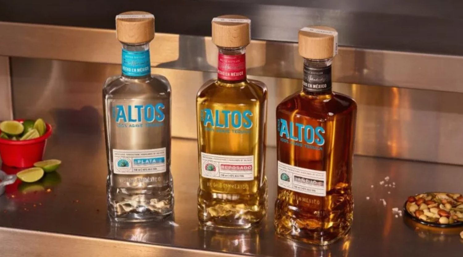
Altos’ new bottles are inspired by the brand’s Mexican heritage and artisanal production.
Courtesy of Altos
“Bartenders and consumers love Altos for its authenticity, craftsmanship and quality, but in today’s crowded tequila market, liquid that wins on taste needs packaging to match,” says Daniela Via — Global Marketing and S&R Vice President at House of Tequila, Pernod Ricard. “Our new bottle makes sure Altos stands out at first glance. It’s bold, attention-grabbing and unmistakably Mexican — perfectly-crafted to win consumer consideration.”
The redesign of the Altos bottle reflects the brand’s continued commitment to sustainability. While glass bottles are fully recyclable at the end of their life, it now includes 3% post-consumer recycled (PCR) glass, supporting the brand’s efforts to close the loop and give waste a second life. In addition, the bottle has undergone a lightweighting process, reducing the weight of its glass bottle by 5.6% while maintaining its visual impact and brand identity.
House Wine Introduces Vibrant Kodachrome Can Packaging
House Wine, the number one aluminum can wine brand and maker of best-selling Rosé Bubbles, has unveiled its vibrant new Kodachrome packaging. This colorful redesign brings a splash of color and fun to every sip, reflecting the brand's commitment to inclusivity, convenience, and quality.
House Wine has consistently upheld a commitment to transparency and inclusivity since its inception, and its long-standing partnership with Human Rights Campaign (HRC), the nation's largest LGBTQ+ advocacy organization, and eco-friendly packaging.
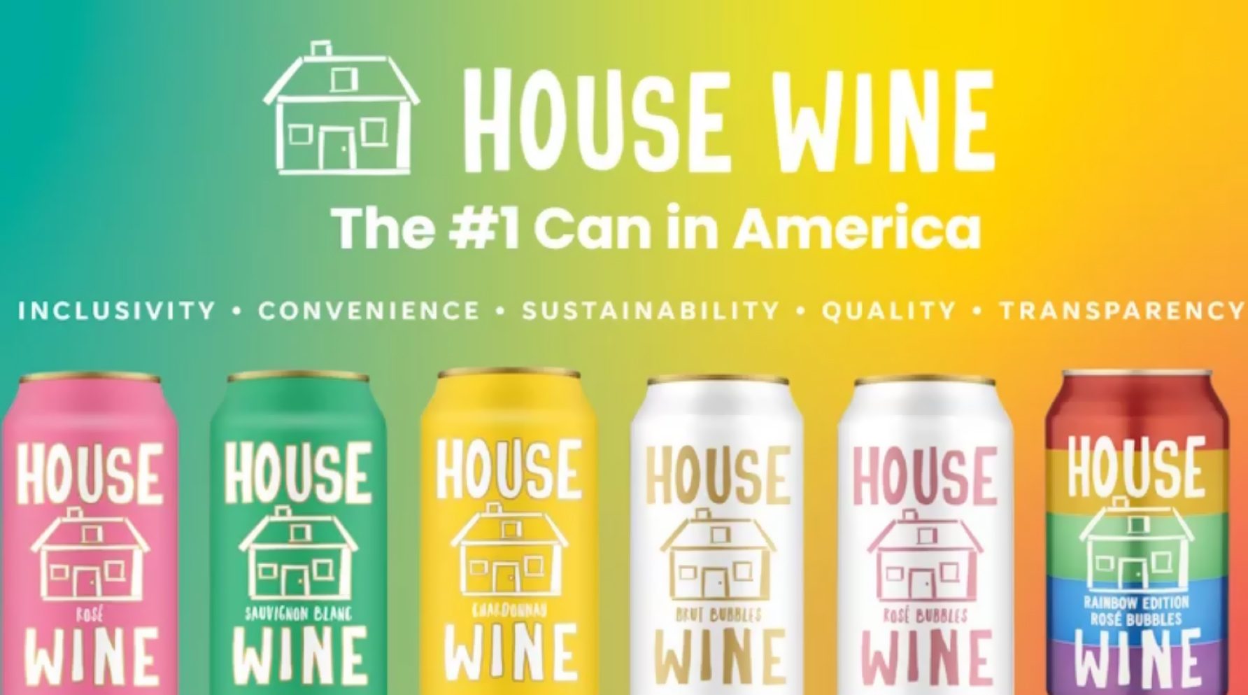
House Wine’s new cans reflect the brand's commitment to inclusivity, convenience and quality.
Courtesy of xxx
Building on this foundation, House Wine is now expanding and enhancing its nutritional information to provide consumers with greater clarity about what they're enjoying, including calories, carbohydrates, fat, and protein levels. This move aligns with the growing demand for products that not only taste great but also aligns with consumers' values and dietary needs.
The bold, colorful new look of the cans mirror House Wine's mantra that great wine should be fun, welcoming, and easy to enjoy — anytime, anywhere, by anyone. Crafted with care and transparency, House Wine delivers maximum value without compromising on taste, which has kept it at the top of the canned wine category for years. Alongside its updated wardrobe, 2025 brings two new 355ml canned products from House Wine: Mimosa and Red Bubbles.
“Our vibrant new Kodachrome packaging is a reminder that enjoying great wine doesn't have to be complicated or pretentious,” said Alex Evans, Chief Marketing Officer. “It's about embracing the joy of sharing a glass — or can — with friends and family. This packaging reaffirms our commitment to transparency and inclusivity — because we think wine should be for everyone, and that's something to celebrate.”